Thursday, June 13, 2013

Film Petit: Napoleon Dynamite


....present friggin' Film Petit. Gosh.


It's a good thing Hendrix was in a very foul mood for photos. His new anti-pictures stance is very Napoleon. 


Rex has always been one of my very favorite parts of this movie. I love everything about him. "Fugit about it!"


I think I'll just fill this post with Rex gifs. No one would object to that, right?


"You're gonna learn to discipline your image. You think I got where I am today by dressing like Peter Pan over here?"

As hysterical as the roundhouse kick pants would have been, the kids needed summer play clothes. So Hendrix got the racer shorts version. I'm sure he could still roundhouse things in these though. I got to use a new pattern that will be released soon from Dana! It's a great pattern, for girls and boys with lots of options. Keep an eye on Dana for its release. I used Lizzy House's Constellations fabric and Riley Blake chevrons from Sewn Studio


 Elsie's kind of Kip from the waist down and Napoleon from the waist up. I made her shorts using Dana's same upcoming pattern and a very nice Robert Kaufman denim. So nice to sew with. I even put lion/ tiger fabric on the pocket linings, but forgot to take a picture!


So, we're pretty much friends by now right? So you got my back and everything right?


On my freezer-paper stenciled shirt, I changed the horse to a llama in honor of Tina. It's so quietly weird. Kinda like the movie. Even though it's not exactly cool anymore to go around dropping ND quotes, they are still just as hilarious as ever. I love it.


Whoa you guys: to see how the pros do it, you have to spend some quality time with our beautiful guest Delia Creates today. WHOA. She is the one who made that awesome intro banner for us too- amazing!! She made THE perfect Napoleon pants, plus hilarious tees and an adorable little Pedro outfit.  And to top it off, she took pictures at the real setting of the movie! Delia has seriously been the sweetest most patient guest ever. Thank you for everything girl!  Go now, it's friggin sweet. 


And Kristin perfectly recreated one of the most hilariously awkward scenes in any movie, let alone this one. Her little Deb and Rico are ADORABLE. See it at Skirt as Top


So that wraps up another edition of Film Petit. You can catch up on past installments here... I'm gonna go practice my sweet dance moves. 


Tuesday, June 11, 2013

do. Good Stitches Flying V Quilt


I finished this quilt a few weeks ago and finally took pictures today. This is definitely my favorite DGS quilt yet! Do Good Stitches is a charity bee I've been in for nearly two years. Every few months, I get to be the designer of the quilt my circle of the bee makes. 

This one was inspired by my friend Andie's minimalist flying geese quilt, featured in her awesome book. 


Of course, mine couldn't be quite as minimalist as hers, or else my group wouldn't have had much sewing to do! Instead of the standard 2 12" blocks, I instructed everyone to send me a strip of 12 flying geese units all joined together going the same direction and on a white background. They each finish at 6" x 3". 

I told them to block the colors together instead of mixing them all up, and to use this block for color inspiration:
Japanese + & x


They matched those colors pretty perfectly right? It's my most favorite block from my scrappy Japanese +&x quilt.  


So once I had everyone's strips in the mail and made my own, (second from the right side is mine) I added more white fabric on either side of the geese and joined them together, staggering one unit off with each one, and alternating directions. Originally, I imagined them all going one direction and all facing to the side of the quilt, rather than going vertically. But once I laid everything out, this way just looked much better. Flexibility is my middle name. (Actually, it's Elaine... I know you were wondering.)


I did straight line quilting, vertically just like the geese, about 1/2" apart. With all that white space, I knew I wanted to do heavy quilting. I think the simple straight lines are just perfect here. Always my favorite. 

The binding is the dictionary text print from Moda's Mama Said Sew, ordered a while back from Pink Castle. Except that one little spot where I ran out and had to use some Flea Market Fancy. (See? Jessica Flexibility McFlexyFace!)


The backing is all this pretty Vintage Modern print (Bonnie & Camille for Moda) from Sewn Studio on clearance. I just love the color.

I didn't wash this quilt before taking pictures, which is the opposite of my norm. I just wanted the smooth look for pictures, but I'll definitely be giving it a good wash-n-crinkle before dropping it at Project Linus this week. It's a good thing, because I've already got most of the blocks in for my next do good quilt!


Tuesday, June 4, 2013

Pillow Talk Swap 10 (Let's talk about fabric.)


I think most of us have a fabric comfort zone right? Most of it has to do with taste, but some of it has to do with confidence. Like sometimes, you might really like a certain type of fabric but you fear you might not have the skill to do it justice. Like it's too unfamiliar to wield it's power. 

I think this project was out of my comfort zone for both of those reasons. If you aren't familiar, the Pillow Talk Swap happens on Flickr between about 100 quilters and sewists from all over the world. Being in its tenth round, it's gained a certain level of expectation. If you join that swap, you do not want to be the one that makes a clunker of a pillow. (Round 9 was my first time joining, you can see the pillow I made last time here.)


So my partner likes things that are light and girly and pink and vintagey. I appreciate that a lot, but it's not my zone. I need edge and angles and contrast and some black in there somewhere. But that is what makes these things fun and stretching right? 

Before I whine too much about these fabrics not being my style, I should say that I really do love them at the same time. Is that weird? I do, I think they are gorgeous. They are mostly from Liberty Lifestyle's Bloomsbury Gardens line and I picked them up at Sewn Studio.  If you didn't know, I work at Sewn and it's a really beautiful modern fabric shop. Here's the thing that's happened to me since working there- I just love every fabric we have. Yes, I still have my tastes and I definitely can't buy and use all of it, but nearly every bolt that comes in the door makes me think about what I would do with it. And even if I kinda "hate" the style of it, I still love it because it's pretty fabric. If we had not got this Liberty stuff in at the shop, I never would have even considered buying it online or anything. I wouldn't have paid any attention. But then you see it in person, and it's just PRETTY. And then you touch it... case closed. I may complain about it's girly-ness, but if I'm being honest I needed an excuse to buy it. (And it was actually my second time buying it, so what does that tell you? Who am I?) 


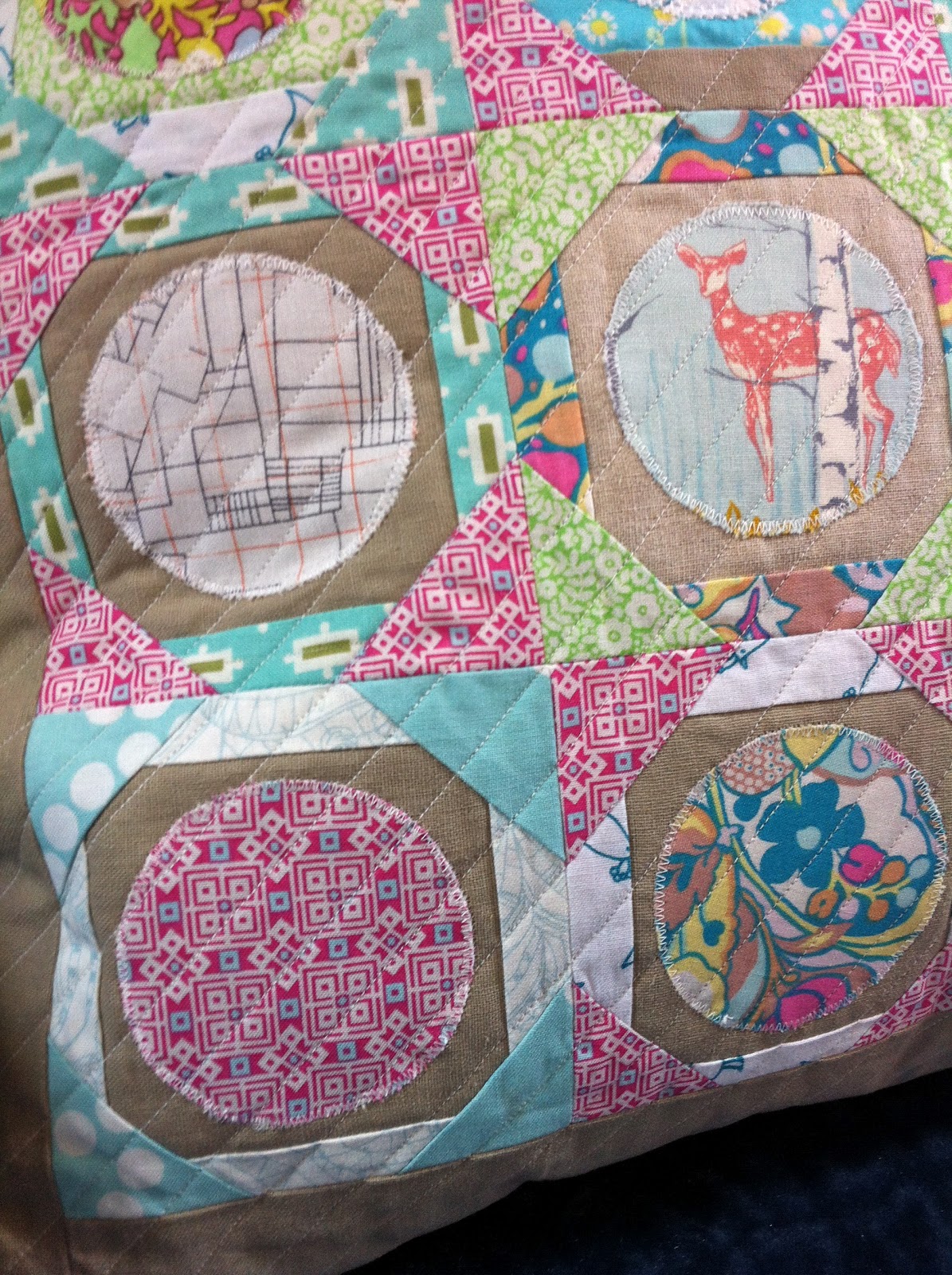
The pillow is made up of 16 little 4 inch "tea plate" blocks. At least I think that's what they are called. I saw them in a random quilt block book at the store one day and thought they had a great vintage look that would go with my fabric pull. Plus they seemed like they would lend themselves to playing with low-ish volumes and a bit of linen. I don't normally go for something involving appliqué anything, but it really wasn't that painful. I added one linen border and quilted with close together straight lines on the di-ag. That quilting is definitely my zone. I had to hang on to one shred of stubbornness here.

So although this was one of those projects that had me wondering if my choices would actually work out the whole way through, I think most of them did. I'm happy that I made something I like even though it isn't something I ever would have made for myself. But most importantly, I think my partner might love it and I really hope she does. It's on its way now!


This is the new project I'm working on now. Simple block, scrappy, all circles and geometrics, with a limited color scheme involving brights with some gray and black. That is totally my zone. It's funny because someone commented on this IG picture (I'm @alittlegressica there) that they were "glad to see me back" because that pillow cover I had been posting had them a little worried. I kind of love that, because it means to them I have a certain style. Sometimes it's hard to see that in yourself, but I'm seeing it now. I don't think that person was being mean about the pillow, it's just not something they expected from me. It's a very nice compliment. 


So just to make sure I'm not a crazy person, could you tell me about your fabric zone? And what's the type/line/substrate/designer of fabric you might like, but are also slightly afraid of being clumsy with?